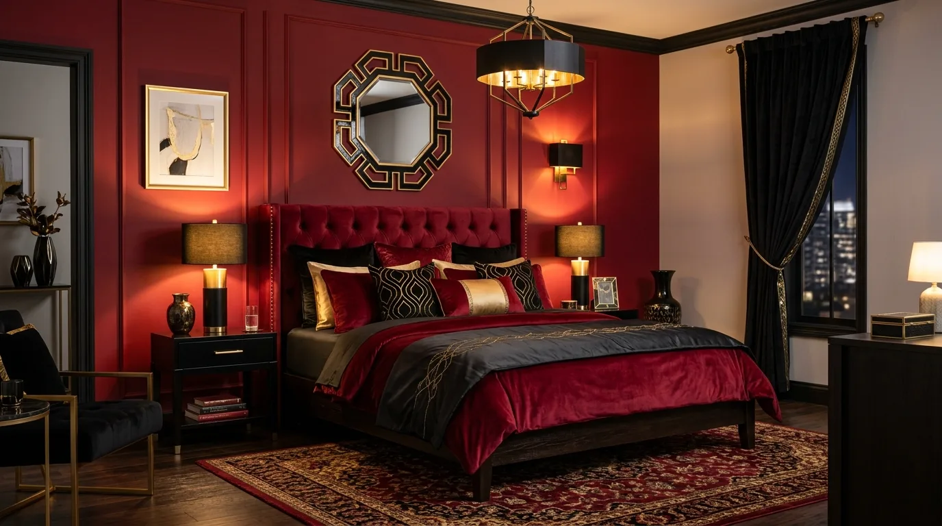
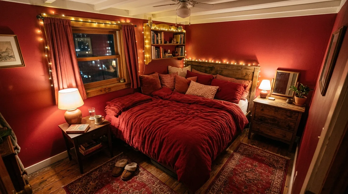
Red can be a surprisingly beautiful bedroom color when it is used with intention. It brings warmth, drama, and emotional richness, but it works best when balanced with the right neutrals, textures, and calmer supporting tones.
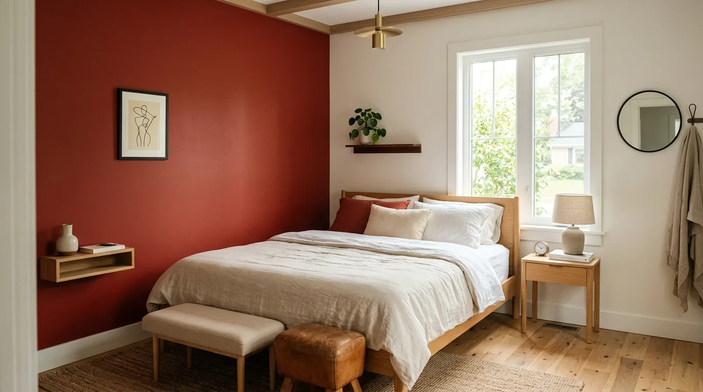
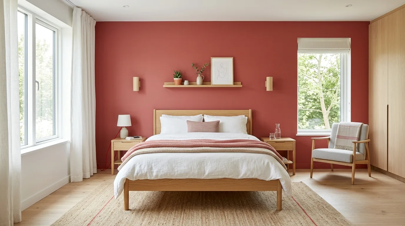
Try a red accent wall
One red wall can add strong character without making the entire room feel overwhelming. It gives the bedroom a clear focal point right away.
Styling tip: Give the wall feature enough blank space around it so it can read as a focal point.
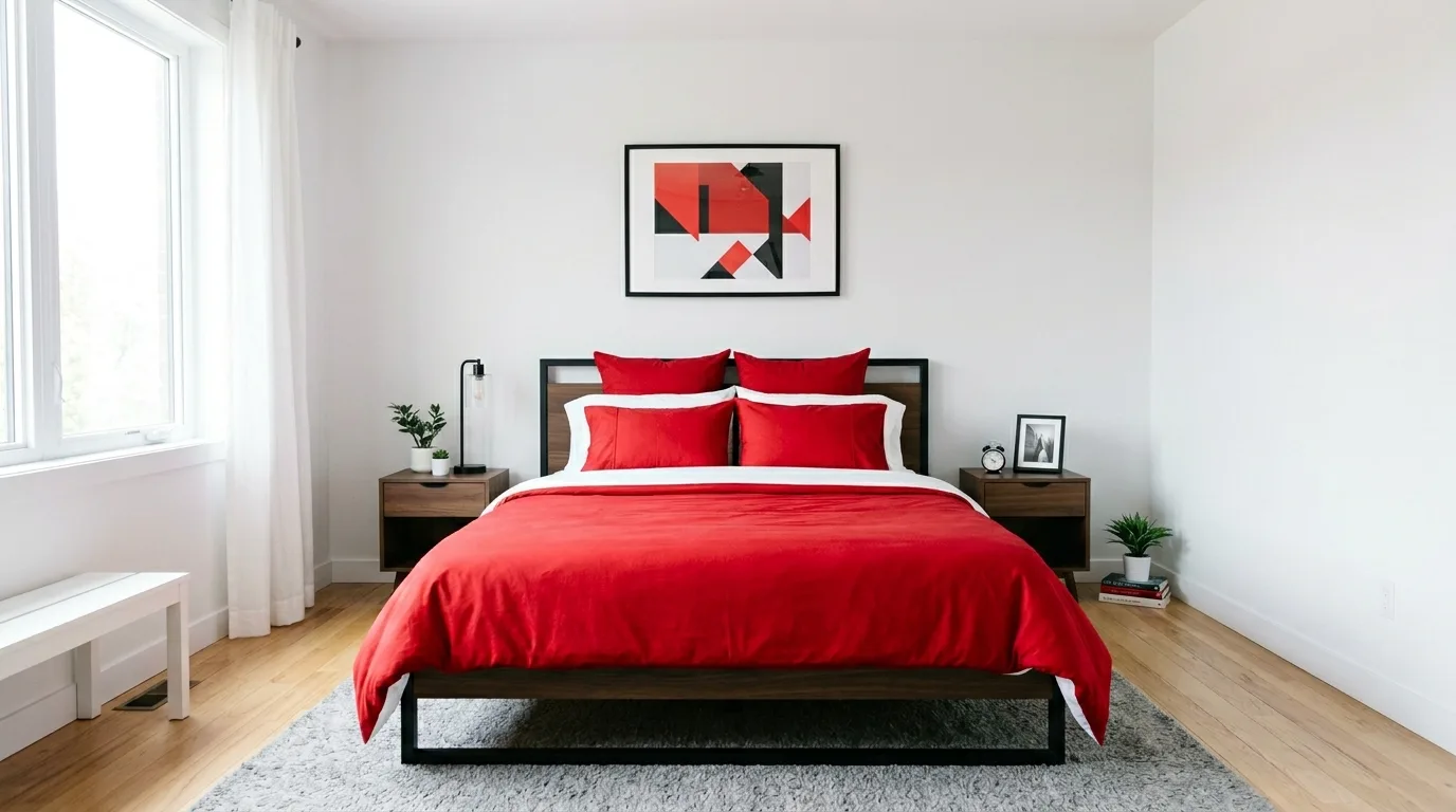
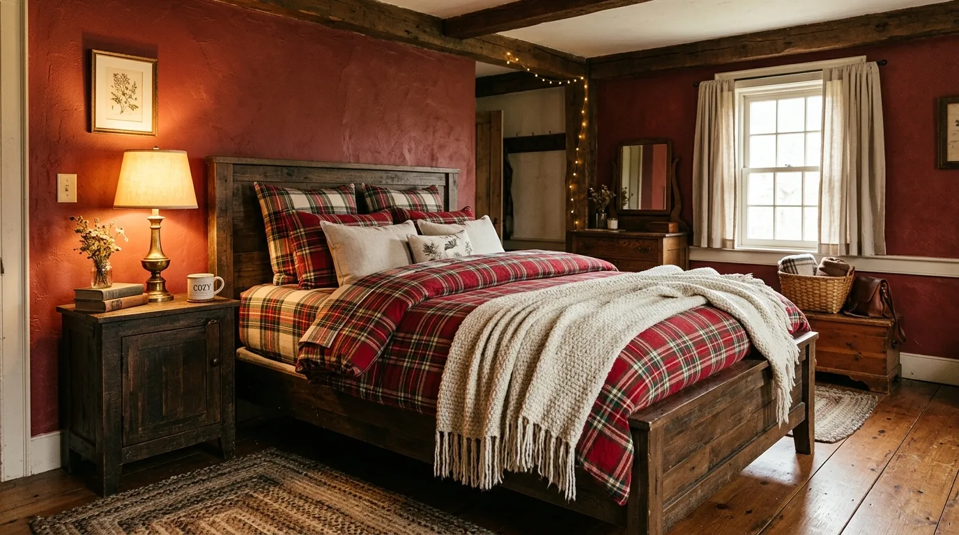
Use red through bedding first
If painting feels like too much, red duvets, throws, or pillows can bring the color in a softer, more flexible way.
Styling tip: Repeat the main color in a few places so the look feels connected instead of random.
Pair red with cream or beige
Lighter neutrals keep the room from feeling too intense and help the red feel richer rather than harsher.
Styling tip: Keep the lighting warm and soft so the setup feels inviting instead of harsh.
Add dark wood for depth
Dark wood furniture works beautifully with red because it gives the room more grounding and a slightly more classic, luxurious feel.
Styling tip: Keep the lighting warm and soft so the setup feels inviting instead of harsh.
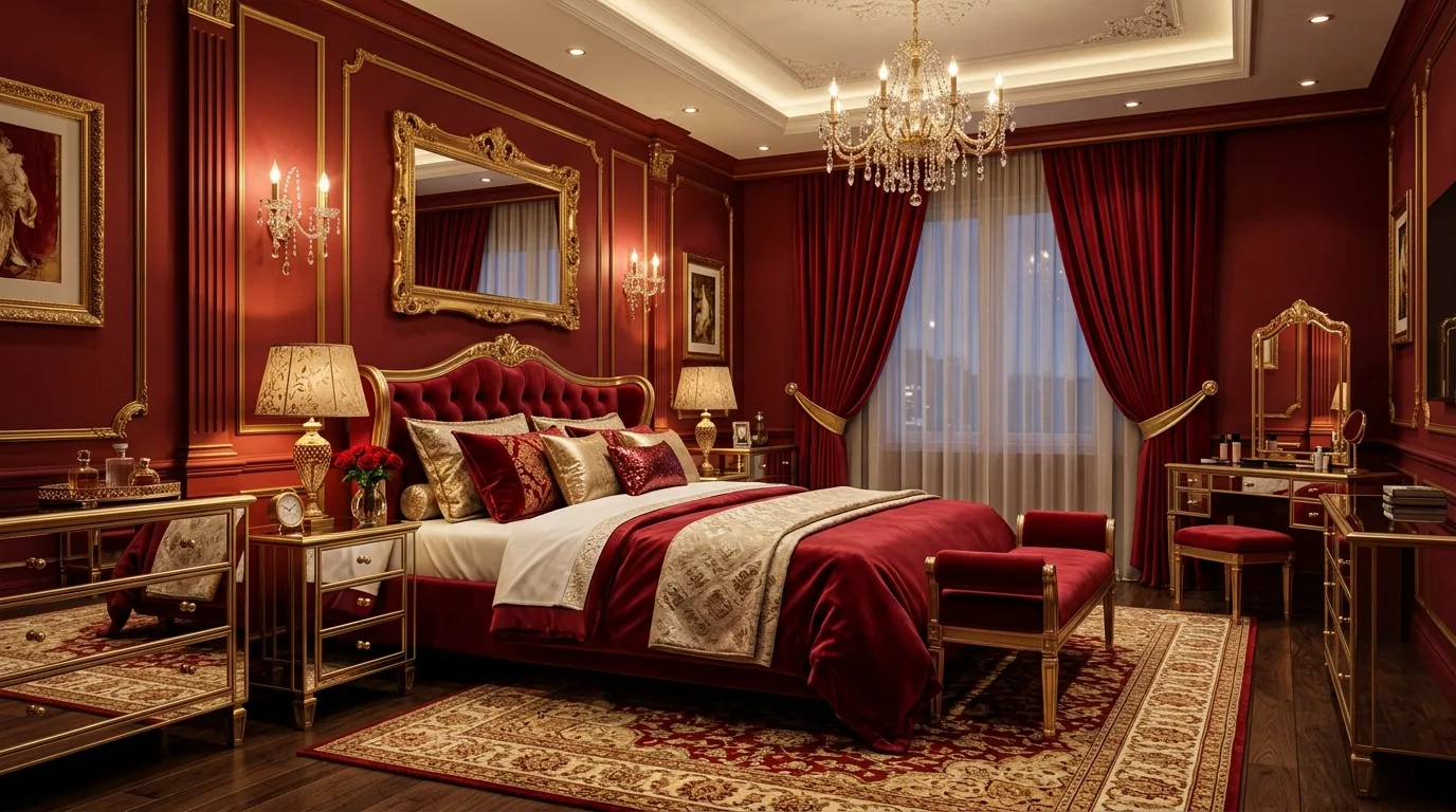
Use black accents carefully
A little black in lighting, frames, or furniture can sharpen the room and make the red feel more dramatic and modern.
Styling tip: Keep the lighting warm and soft so the setup feels inviting instead of harsh.
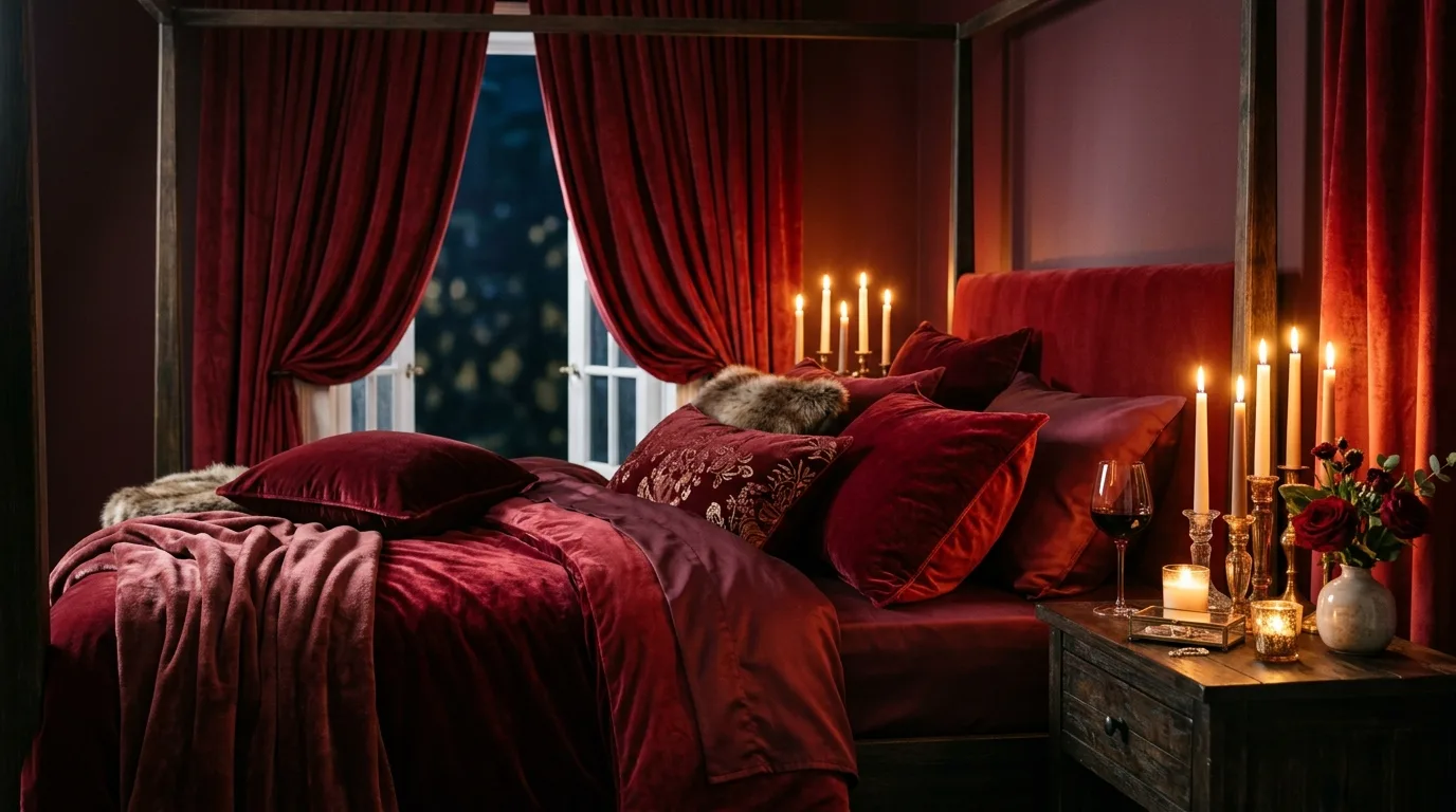
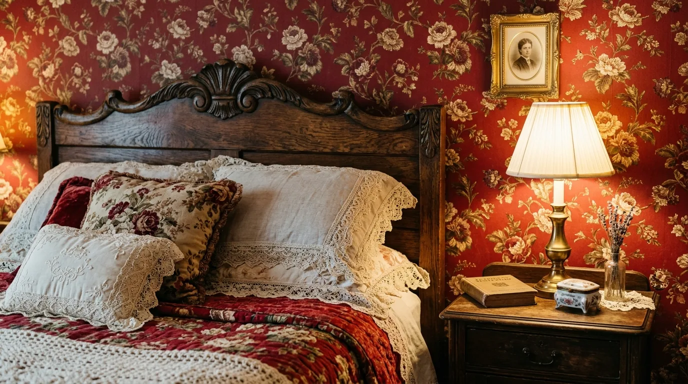
Try muted or earthy reds
Brick, rust, wine, or terracotta-leaning reds often feel more sophisticated in bedrooms than very bright primary tones.
Styling tip: Give the wall feature enough blank space around it so it can read as a focal point.
Use art to echo the palette
Artwork with touches of red helps the room feel more cohesive and stops the color from seeming isolated to one area.
Styling tip: Repeat the main color in a few places so the look feels connected instead of random.
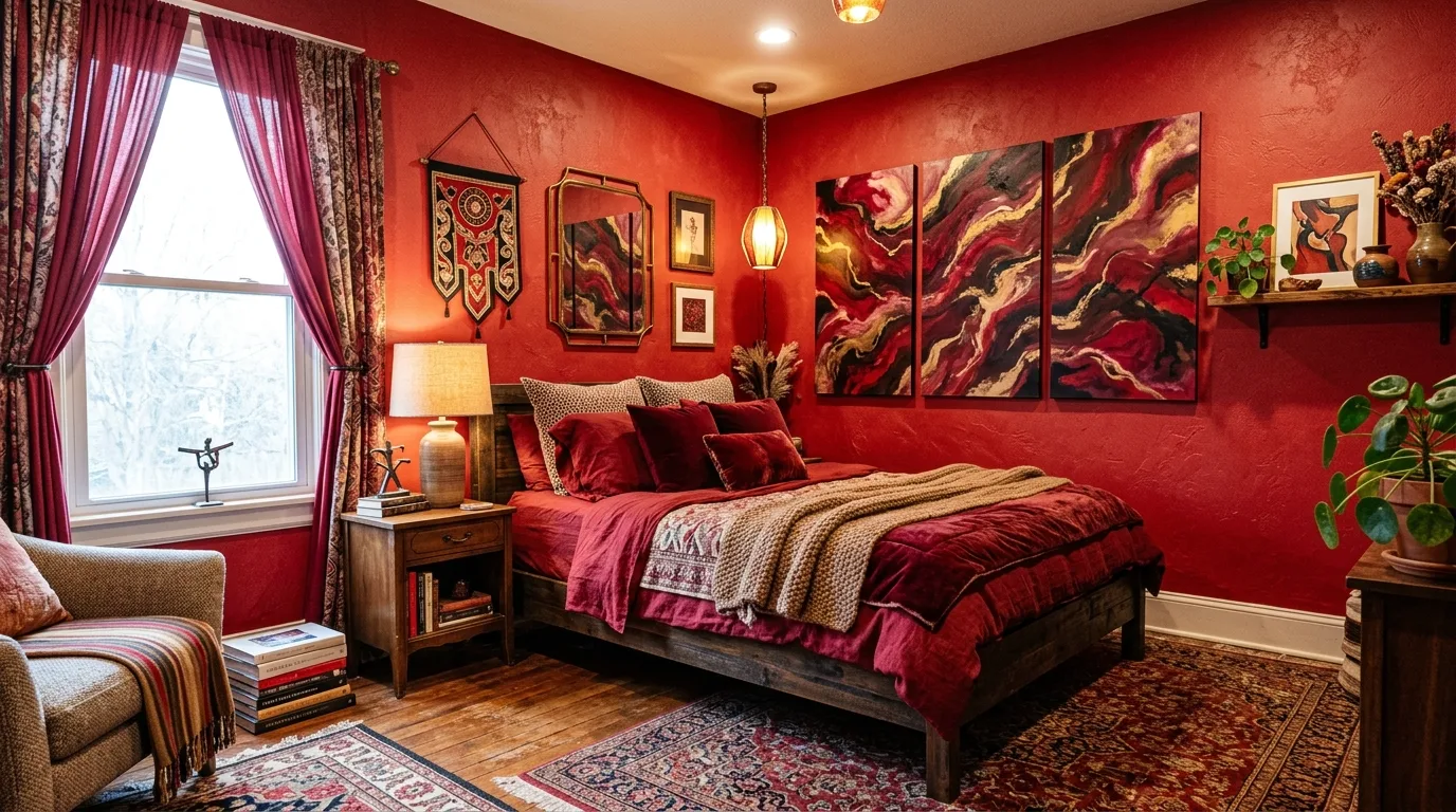
Soften the look with layered texture
Velvet, linen, and rugs can make a bold red room feel more inviting and less visually hard.
Styling tip: Layer one or two soft textures instead of adding too many decorative extras.
Keep clutter very controlled
A strong color palette tends to look better in a room that feels edited. Too much visual noise can make bold red feel chaotic.
Styling tip: Repeat the main color in a few places so the look feels connected instead of random.
Let the room feel bold but restful
The best red bedrooms still support sleep and comfort. The goal is passion and warmth, not visual stress.
Styling tip: Focus on red feels strongest when it is balanced rather than everywhere at once.
Final Takeaway
Red can be a surprisingly beautiful bedroom color when it is used with intention. Start with red feels strongest when it is balanced rather than everywhere at once, then build around the pieces that make the space feel easier to use and nicer to look at every day.